3 Custom Designed StoryBrand Websites
Interested in StoryBrand Websites? Here are three custom designed sites to give you an idea of what's possible!
Banker Creative Custom Designed
StoryBrand Websites
We are a words-first agency. Getting the right words for your website is the most important step. There is no point in spending time and money to design a site that looks beautiful but doesn't convert.
That's why we have a number of StoryBrand Certified Guides who know your industry and are ready to help. They will work with you to create a home page wireframe with all the headlines, subheadlines, paragraph text, call-to-action buttons, and anything else that should go on the front page of your site to make it an effective selling machine.
Here are 3 of our favorite Custom Designed StoryBrand websites:
The Problem
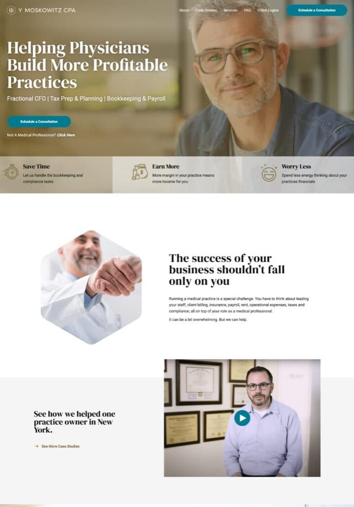
Y. Moskowitz had a great niche in the CPA industry: accounting for physicians and practices. But building a website was not as easy as he had hoped. "Just before finding you guys, I flushed $7,000 down the toilet on a website redesign that I never even launched because it was so bad." Yoel needed someone who would spend the time and energy listening to him, but more importantly, discovering the struggles, fears, and needs of his clients.
The Solution
One of the biggest hurdles for a site visitor to overcome is trust. We helped display Yoel's trustworthiness by emphasizing case studies, testimonials, and videos from real people he had worked with. Word of mouth marketing is still the most powerful way to convince someone that you are worth of their trust. And in the financial industry, trust is critical.
Considerations for CPA websites
Compared to many other websites, an accounting firm website is very simple. No need for payment processing or any sort of online store.
Your website should be doing five things:
- Communicate (with words) what you do, who you do it for, and how to get it.
- Communicate (with words & design) that you are professional, competent, and a premium service
- Get people to schedule calls with your sales team
- Get people who aren’t ready to buy onto your email list
- Connecting your current clients with the resources/links they need.
An important things to remember is that it should be easy for current clients to navigate your site, but it should be EASIER for prospects to find what they need. A current client doesn’t need a giant “client login” button, they can find the small link in your nav menu or footer.
Don’t forget the primary purpose of your website: sales. You want your website to bring in clients who are the right clients. With that in mind, words sell. Spend time to craft words that lead to more sales. Simple, right? Not always. We recommend you work with a certified Storybrand guide to create a Brandscript and wireframe for your homepage. Thankfully, we have a Storybrand Guide here at Banker Creative who would love to work with you.
The Problem
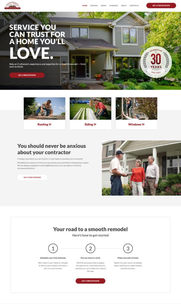
Craftsmen had been around for decades. They are a trusted name for side, roofing, and windows. But they had a website that looked as old as their company. They need a modern, update style as well as clear messaging and easy user experience.
The Solution
A hyper-clear call to action takes pressure off of a site visitor. "Get a Free Estimate" was the perfect call to action as it also positioned Craftsmen as a generous company that gives things away for free. We repeated the CTA all throughout the site so that there was no question: the first step in getting service was to schedule an estimate. Website visitors don't want to be hoodwinked. They want to know exactly what it is you want them to do. That way they can make an informed decision. We also placed a free ebook (with email capture) on the homepage: "9 Tips To An Awesome Contractor Experience." Free content that a visitor could find valuable and an opportunity for Craftsmen to follow up with the prospect later.
Considerations for Construction Websites
Most contractors think about their websites as nothing more than a portfolio page, and in many ways, they’re right. Prospective clients want to see your work. They want to know that you produce quality deliverables. But your website is so much more than a portfolio.
The first question you need to ask yourself when thinking about your website is, “What do I want my website to do?” Do you want to people to “OOoh” and “Aaahhh” over your projects, or do you want your website to lead to more and better projects? That’s the key. Your website is primarily a sales tool. The portfolio element is just a small part of that larger picture.
At the end of the day, the words you use on your website are going to make the difference between a website that looks good and a website that brings in more and better clients.
The Problem
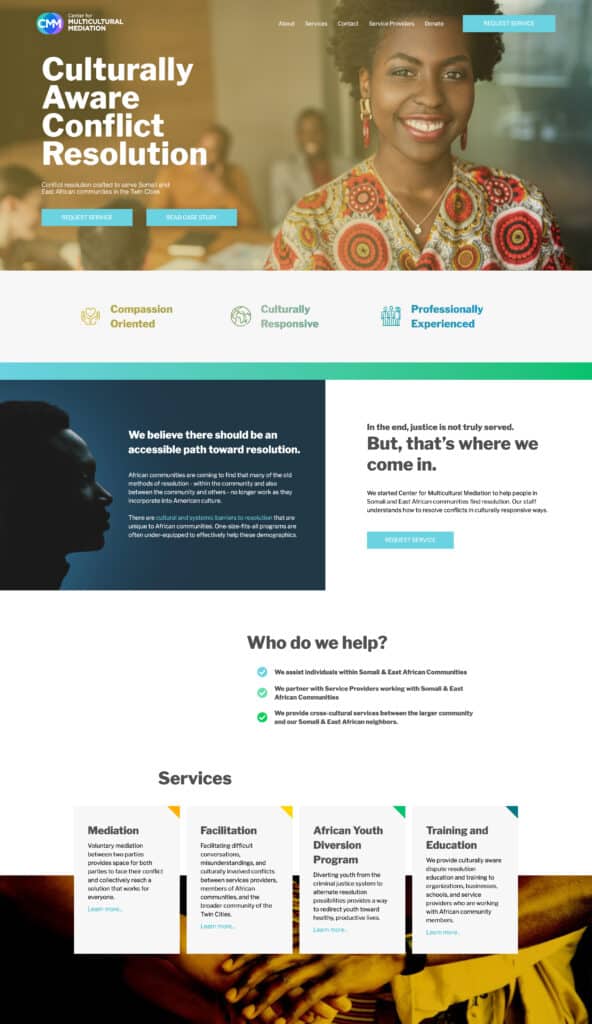
CMM does great work. Unfortunately, it doesn’t always get noticed by the audience they’d like. When we met CMM, they were serving a very specific demographic and needed messaging that spoke to both their clients and partner agencies who would refer clients to them. They needed a professional website that would build confidence with government agencies and other organizations while also connecting to East African Migrants who might need CMM's services.
The Solution
We built a brand new website based on messaging that emotionally connected with the target demographic. We added separate pages to educate partner agencies on the unique difficulties that East African migrants face within the judicial system. We created a site map which was easy-to-use and intuitive, with a flow that invited each audience to partner together. We also provided new branding, a new logo, and a physical brochure for their African Youth Diversion Program.

Considerations for Nonprofit Websites
Non profits often need to craft messaging that engages who entirely different demographics: clients and donors. Since non-profits often depend on the generosity of those who believe in their cause, it can be easy to write ALL the content with donors in mind. But, you also need to connect with those people you hope to serve through your nonprofit.
We recommend that you focus your primary messaging on your prospective clients and build a separate landing page that targets your donors. Your nonprofit, after all, exists to help people. Trust that your donors know that and they will feel confident when they see that your website clearly communicates your mission and connects with your prospective clients on a deep, empathetic level.
Conclusion
Your industry is going to have unique obstacles that your website is going to need to address. Banker Creative has StoryBrand guides ready to help make the most of your website. Build a site that brings in more customers!
Should We Talk?
If you think Banker Creative would be a good fit to help you take your marketing to the next level, please fill out this form so we can schedule a call.
"*" indicates required fields
Quick Links
Who is Designing Your Next Website?
Let's talk about how Banker Creative can help you develop a new website using Storybrand principles that will grow your business .

