Wits Financial
The Client
Wits Financial
Who are they
Wits Finacial is an extension of Wits Realty, managing Employee Benefits for small businesses in Minneapolis and beyond. They create personalized benefits packages that fit your company, including Health Insurance, Life Insurance, Retirement Plans, Vision and Dental Coverage, Disability, and Executive Benefits. They are committed to increasing your employee's experience and your company's reputation.

Words First
Words lead to more sales. That's why we spend the time needed to get to know you and your ideal clients.
Meet Our Spearhead:
Heather Frechette-Crowley
Heather is the founder and principle of Rootwork Marketing. She has over 20 years of marketing experience, working with both small businesses and multi-billion dollar global entities. Heather is a StoryBrand certified guide and is an expert at writing messaging that connects with website visitors on a gut level.
Problem
Wits Financial is a brand new brand under its parent company Wits Realty. They needed to clearly articulate their offerings, make an emotional connection with potential clients (target audience: HR department heads and owners), and distinguish themselves from their parent brand all while maintaining a level of brand consistency with that same brand and sister brands.
Solution
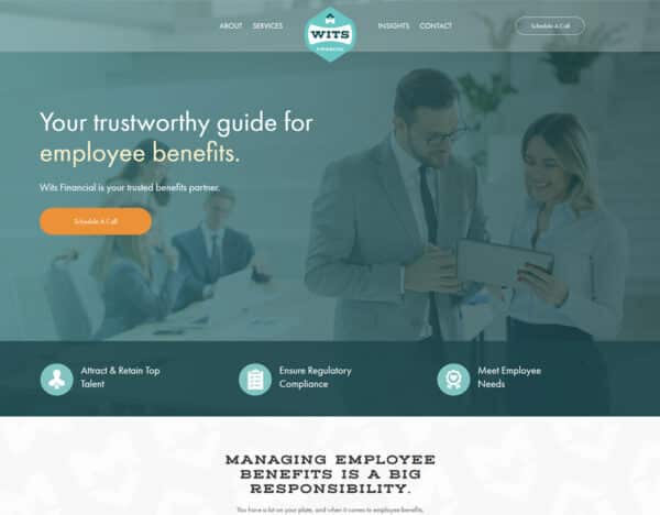
Less is more. We kept it simple and straightforward, presenting Wits Financial as a guide to all things Employee Benefits. We address the potential client's top fears (Retention, Compliance, and Employee Satisfaction), while proposing that benefits can be EASY.
Top-Tier Design
Good design supports good messaging and increases brand authority.
Driving Design Concept:
Our challenge with the Wits Financial website involved the delicate task of aligning it with the bold and dynamic brand of its parent company while also cultivating a distinctive identity. The objective was to create a design that balanced sophistication and playfulness, echoing the existing vibrant aesthetic, while also resonating with business leaders. To achieve this, we refined the color palette, opting to use the dark teal as the primary hue, and reserving orange for impactful calls-to-action. When it comes to typography, our focus was on achieving a blend of elegance and readability, retaining two of the existing fonts while discarding the more playful option. The outcome is a polished, high-end visual website that serves as a unique yet harmonious extension of the parent brand, effectively capturing the attention and approval of their target audience.
Color & Fonts:
Custom Graphic:
Words First
Words lead to more sales. That's why we spend the time needed to get to know you and your ideal clients.
Meet Our Spearhead:
Heather Frechette-Crowley
Heather is the founder and principle of Rootwork Marketing. She has over 20 years of marketing experience, working with both small businesses and multi-billion dollar global entities. Heather is a StoryBrand certified guide and is an expert at writing messaging that connects with website visitors on a gut level.
Problem
Wits Financial is a brand new brand under its parent company Wits Realty. They needed to clearly articulate their offerings, make an emotional connection with potential clients (target audience: HR department heads and owners), and distinguish themselves from their parent brand all while maintaining a level of brand consistency with that same brand and sister brands.
Solution
Less is more. We kept it simple and straightforward, presenting Wits Financial as a guide to all things Employee Benefits. We address the potential client's top fears (Retention, Compliance, and Employee Satisfaction), while proposing that benefits can be EASY.
Top-Teir Design
Good design supports good messaging and increases brand authority.
Driving Design Concept:
Our challenge with the Wits Financial website involved the delicate task of aligning it with the bold and dynamic brand of its parent company while also cultivating a distinctive identity. The objective was to create a design that balanced sophistication and playfulness, echoing the existing vibrant aesthetic, while also resonating with business leaders. To achieve this, we refined the color palette, opting to use the dark teal as the primary hue, and reserving orange for impactful calls-to-action. When it comes to typography, our focus was on achieving a blend of elegance and readability, retaining two of the existing fonts while discarding the more playful option. The outcome is a polished, high-end visual website that serves as a unique yet harmonious extension of the parent brand, effectively capturing the attention and approval of their target audience.
Color & Fonts:
Custom Graphic:
We designed this graphic from scratch to illustrate all the elements that go into helping a small business with their accounting needs.

Our Building Process
01. Platform & Technology
We build our sites on WordPress using an intuitive and easy-to-manage page builder (Beaver Builder). We do this primarily because our clients want a website that is simple enough for them to manage on their own: add blog posts, swap out images, make copy changes.
02. Functionality
VA needed an easy way for current clients to find the links they need. We created a Client Center drop-down with everything they could ever need. They also wanted their Calendly Scheduler embedded directly on their website.
Timeline
A standard website project takes between 11 and 16 weeks, depending on how responsive our clients are able to be when we need their input or feedback. Here are average timeframes:
Onboarding: 1 week
Messaging & Wireframes: 3 weeks
Design & Revisions: 3 weeks
Build: 3 weeks
Revisions: 4 weeks
Launch: 1 week
We started the Wits Financial project on June 12th. Our target launch date was November 6th. We were able to launch the site ahead of schedule on October 30th!

Get a Website Snapshot
for $300
A lot of small businesses owners have a nagging suspicion that their website could be so much more. They're right. Change is easier than you think.
We would love to help you get a snap-shot of your existing site. Sign up here and we will send you a 5-10 minute video audit of your homepage.


