StoryBrand
Website Examples
How to Design a StoryBrand Website
Quick Links
Who is Designing Your Next Website?
Let's talk about how Banker Creative can help you develop a new website using Storybrand principles that will grow your business .
What makes a "StoryBrand Website"?
Donald Miller's Building A StoryBrand has been a game-changer for how businesses approach their marketing. It's been the catalyst for hundreds of companies to redesign their websites, but it poses the question:
What makes a "StoryBrand Website"?
We're going to dig into some of the important concepts that make a website "StoryBranded" and will also look at some Storybrand website examples that have applied those principles well.
I've been a StoryBrand Guide since April 2017 (the 2nd month they began certifying people), and since then I've built over 140 StoryBrand websites and have seen companies double and triple their leads after launching their new website design. I hope this is a helpful guide as you work on your own website design.
If you'd like to talk about hiring our team to design your Storybrand website, schedule a call so we can learn more about your company and see how we can help.

1. The Elements of StoryBrand Website
There is no one "official" way to create a StoryBrand website. StoryBrand (the company) doesn't prescribe a particular layout or flow for a website design. But there are common best practices that are recommended. There is no RIGHT way to do it, but there are BETTER and WORSE ways.
Before we get into the elements of a StoryBranded site there is some foundational work to be done: developing your BrandScript.
THE BRANDSCRIPT
If you have read the book or participated in one of the online courses you understand the concept of a Marketing BrandScript. Using the StoryBrand 7-Part Framework you develop marketing copy that invites your customers into a story. StoryBrand has a great tool that you can use to help you develop your BrandScript.
If you don't have a BrandScript, you can't develop a StoryBrand website.
Some people try to skip this stage and jump right to reworking their site based on whatever they remember from reading in the book.
The problem is, half of effective marketing copy is deciding what NOT to say. If you don't do the hard work or simplifying, clarifying and deleting, your messaging is going to be a mess.
Do yourself a favor and get your BrandScript in order first.
THE FRONT PAGE
The front page of your site is a sales tool. Even if you have returning customers or other people that use your site, the front page is for PROSPECTS. Everything there should be focused on turning browsers into buyers.
When people think about a StoryBrand website, they are mostly thinking about the front page of a website. This article is going to be focused almost exclusively on the front page.
The most common layout for a StoryBrand website is a "long scroll" page with multiple horizontal blocked sections. Part of the reason this is good website design is that more than 50% of your visitors will be viewing your site on a mobile phone and it's much easier to scroll through content than it is to click on links and navigate to interior pages to find what you're looking for. Network speeds and the ubiquity of WIFI have made it possible for large pages with a lot of photos to load quite quickly.
WIREFRAME
A wireframe is a simple outline of your front page that shows the order of your page sections with the copy (headlines, bullet points, body text, etc) filled in, but with very few design elements.
You can draw out a wireframe in a notebook, use a program like Adobe XD (what we use), or even use Powerpoint as a way to organize your sections.
IMPORTANT NOTE: Your BrandScript determines WHAT you say, not the ORDER you say it.
A common misconception is that the sections of your website design sections should follow the same order as your BrandScript (Character wants > Problem > Guide....) But that's not true. There are no hard and fast rules for what order your content should be presented. It's more art than science.
That being said, there are common types of sections that sync up with sections from your BrandScript.
- Hero Image Section
This is the first thing someone sees when they land on your site. It includes your HEADLINE, SUBHEADLINE, and CALL TO ACTION button. You may also consider in your website design how your logo and navigation menu fit here. - Value Stack
This is usually three or four quick-hit value propositions that usually come from the Success section of your BrandScript. They are often accompanied by icons. - About Us
This section of your website design is usually the place for content from your Guide section. The goal is not really to tell your customers ABOUT your company (history, structure, bio), but instead to explain how your experience and expertise helps you understand and solve problems for your customers. - Authority Signifiers
Another Guide section. Display logos of companies you've worked with, or a testimonial from a client, or possibly awards that you've won. - 3-Step Plans
From the Plan section of your BrandScript. Ideally no more than three or four steps, usually describing the process of how someone would start to do business with you, or the stages that you will engage in with your client to solve their problem. You might even have more than one PLAN on your page. - Agreement Plan
Another Plan section. This is where you describe your promise to the customer, or a philosophy behind how you do business so that you serve your customer well.
Other BrandScript elements
The Character, Problem, Call to Action, & Failure pieces of your BrandScript don't usually have their own defined section on a website. Instead, they are sprinkled throughout the other sections as headlines, bullet points, call-outs, etc.
Wireframe Example:

Who is Designing Your Next Website?
Let's talk about how Banker Creative can help you develop a new website using Storybrand principles that will grow your business .
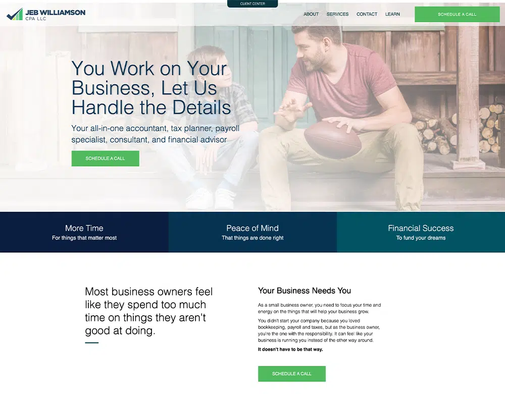
2. Header/Hero Section

AISB - Hope International School
hopeintlschool.org
Designed by Banker Creative
A good Storybrand website design employs a header answers three questions within 5 seconds of someone landing on your page:
- What do you do?
- How will it make my life better?
- How do I get it?
If your above-the-fold content doesn't answer these questions, or if there's too much going on and it's is confusing the message, you're losing sales.
HEADLINE
Your headline should be aspirational and specific. Either communicating what your customer wants (character section of your BrandScript) or how they want to feel about themselves (transformational identity).
SUB-HEADLINE
A super clear description of what your company does/offers. Avoid vague words like: strategies or solutions. Instead say things like: "we build houses and commercial buildings" or "Seminars and workshops to train you to be a better leader".
Sometimes the Headline and Sub-headline can switch roles where the headline can be specific and clear, and the subhead can be more aspirational (see Cottages of Dakota).
Header/Hero Section Examples


CALL-TO-ACTION BUTTON
Always give your customer a clear option to hire or purchase from you. The button should say: Hire Me or Schedule a Consult or Buy Now. Avoid things like: Learn More and Get in Touch.
Your CTA buttons should be the same throughout the page. Don't ask someone to "Schedule a Consultation" in the header, and then "Speak to a Consultant" in the next section. They should be the same so they are not confusing.
PHOTO OR VIDEO BACKGROUND
Choose a photo that shows your customer experiencing the SUCCESS that comes from doing business with you. The photo should by aspirational. You can use photos of yourself interacting with your clients, but don't use photos of your building or group team photos.
Who is Designing Your Next Website?
Let's talk about how Banker Creative can help you develop a new website using Storybrand principles that will grow your business .
3. Value Stack Section

Amish Craftsman Furniture
amishcraftsmanfurniture.com
Designed by BankerCreative
A "Value Stack" usually refers to a block of 3-4 statements that describe the value proposition of your service or product. These should be secondary benefits that your customer will experience if the get the thing they want (character) and have their problems solved (problem). These usually come from the success section of your BrandScript.
Here are some great Value Stack statements:
- Save Money
- Peace of Mind
- Grow your business
- Be confident
Value Stack Examples


ICONS
Icons are a good way to focus additional attention on your value stack. We know from research on how people read web pages that visitors often skip over blocks of text, but they scan and read headlines, bolded text, bullet points, and text paired with images or graphics. An icon is a signifier to the brain that this is more important and you should pay attention.
Most website platforms and themes have some icons already installed that you can use. Another great place to get icons is https://flaticon.com
4. Headlines, Bolded Text, Call-out Boxes, & Lists

Moffatt Products
moffattproducts.com
Designed by BankerCreative
It's been proven that people don't READ websites, they SCAN them. So when you're trying to communicate clearly, it's important to use design elements that will stand out so your visitors are more likely to read them.
Use these elements to sprinkle ideas into your website design from the Problem, Empathy, Success, & Failure sections of your BrandScript.
HEADLINES
As much as possible, use every section headline to communicate something from your BrandScript. No wasted copy.
Instead of "About Us", title that section: "We Help You Save Time & Make Money" (Success).
Instead of "Our Services" say: "How We Help You Accomplish Your Goals" (Success).
If your main headline doesn't tackle the main Problem that you solve, make sure you say it in a big font size within the first couple sections of your site.
BOLDED TEXT
As much as possible, try to limit big blocks of text. Paragraphs should be 3-4 lines at the most, or visitors will skip right over them. If you do have a lot of text, pick out a few words or phrases to be bolded. If you do it well, someone could only read the bolded text, they would understand the whole paragraph.
LISTS
On the internet you don't have to use complete sentences. In fact, there are many times when you just SHOULDN'T. A good bullet point or icon list can communicate more information quickly and is more likely to cause a viewer to stop and read.
- Bullet points arrest "scanning"
- They allow you to use fewer words
- Much more impact
- Get more people to read the content that you've spent so much time crafting.
CALL OUT BOXES
Set content apart by using boxes with a border or different color background. These are great for testimonial quotes:
"I wasn't going to read this text, but for some reason, it stood out from the rest of the page and I just had to stop."
-A Casual Browser
Examples


Accounting Complete
accounting-complete.com
Designed by BankerCreative
It's great when the copy on your website shows that you really understand your customer and the problems they have. That's called empathy, and it's half of what you need to prove yourself a trustworthy guide. But the other part of the equation is showing that you are actually ABLE to solve their problems. A guide who understands you, but can't help you is pretty worthless.
The best signifiers of authority come from others. While you're building your Storybrand website, make sure to use past clients and third-parties to show your authority. Here's how:
CLIENT LOGOS
Display the logos of 5-6 companies that you've worked with on your site. The more recognizable the logo the better, but since not everyone gets to work with Coca Cola and Apple, and logo is better than none. You don't need to explain the type of work you've done, but be honest in your representation of who you've worked with, and make sure you use logos of companies that are satisfied with the work you've done.
The purpose of client logos is to show that other companies have put their trust in you before, so prospective clients can feel confident about trusting you in the future. Client logos communicate a lot without muddying your message with extra copy.
AWARDS & CERTIFICATIONS
If your company has been recognized for good work it's ok put it on your website as an authority signifier, just make sure that it's in the context of how you serve your clients. A badge or a logo of the award is nice to include next to the "About Us" section.
Certification badges are similar. A certification shows that you have been vetted and verified by a third party and engenders trust.
TESTIMONIALS
The best testimonials are succinct, to the point, and describe a problem your client had and how you solved it. Bad testimonials are long, focus on your personality ("he was so courteous"), and use phrases like "We're so happy we chose so-and-so".
No one cares if you're a nice person, they care if you can solve problems. Extra phrases get in the way of the core message in a testimonial.
If you ask a client to write a testimonial, odds are they will write a lot of nice things about you. The best thing to do is aggressively edit the testimonial while still preserving the heart of what your client said, then send it back to them and explain "Thank you for such a lovely testimonial, I've edited it for length, does this capture your experience working with us?."
Authority Signifier Examples


6. How to use images and icons effectively

Mile One
mileoneteams.com
Designed by BankerCreative
Images and icons aren’t going to make your website -- but they could break them. Focus on simple, beautiful images that tell a story. Image-wise: we want to see happy people, folks who were helped after utilizing your expertise. Icon-wise: Just don’t get too weird. You might think you’re being clever and original, but remember -- clear is better than clever. Say it again so the people in the back can hear it. Clear is better than clever!
Images are amazing tools, but only when you use them correctly--in this can be a tough balance to find. When used in the right way, they can be powerful signifiers that speak immediately to your audience. Our color choices, images, and icons all should flow from our BrandScript. Our design process typically starts with developing a style guide for our customers. That let’s us understand the primary, secondary, and tertiary colors that best describe their brand. Once we have that, we can apply it to the basics we’ve built from the wireframe.
Icon & Image Examples


7. Three-Step Plan

Moving Performance
movingperformance.com
Designed by BankerCreative
No matter what sort of business you’re in, you need a three-step plan. This lets your customers know what they need to do next. It’s also a way to alleviate some anxiety that they might have about making a decision too fast. You know that feeling when you should go to the doctor, but you just keep putting it off? That’s called anxiety, and we’re looking to stay far, far away from it.
While there’s some wiggle room on this, here’s the basic idea of what you need. Call, Meet, Do! It can actually be labeled that simply too. Don’t get quote heavy or have too much wording. If you need some explanation, use the space under each numbered item for a BRIEF explanation. Here’s an example from our homepage.
- Schedule a Call: We get to know you, you get to know us. We get to understand your goals and desires for this project and you can decide if we would be a good fit.
- Discovery & Planning: A strategist will work with you to define exactly what you need and establish a project scope that works for you and accomplishes your goals.
- Make it Happen!: Our account manager guides you through the StoryBrand process through to completion, keeping you up to date on progress and getting you feedback along the way.
Three-Step Plan Examples


8. Call to Action Buttons

Made to Impact
madetoimpact.com
Designed by BankerCreative
A call-to-action (CTA) is exactly what it sounds like: the moment everything changes. You want your potential customers to feel like they’re making a heroic choice that will completely change the way their story unfolds. While there are a couple different ways to go about this, you need to ALWAYS keep it simple. Like, really simple. Three words simple -- maybe four if you need it.
Make it happen Works.
Call today Yup.
Give our sales team a ring NOPE.
Call to Action Button Examples


Get the idea? We’re looking for a simple phrase that will spur the reader to click. That’s it. Honestly, it can be a little generic -- just make sure that it’s easy to understand and short. More than that and it’s just going to get lost in the shuffle. That’s it, that’s how you get people to do things. OK, are you ready for your CTA? It's a choose your own adventure.
Go make websites.
or...
Download
Price Sheet & Service Offerings
We’re not the cheapest agency out there (but we’re also not the most expensive). We are always transparent about our pricing, so you’ll never get billed for something you weren’t expecting.

Examples


Quick Links
Who is Designing Your Next Website?
Let's talk about how Banker Creative can help you develop a new website using Storybrand principles that will grow your business .